Bootstrap footer able to display relevant information such as forms and advertisement in an elegant style which is highly customisable to match your theme design, and easy to install with a copy and paste method.

Bootstrap Footer Component For Blogger
A footer component is a 'must-have' component that is added at the bottom of a blog page to display forms, navigation menu, a copyright, advertisements or widgets in form of text, images, videos or scripts.
As a blogger, your choice for a footer is not limited to a pre-installed footer and blogger widgets. There are many elegant bootstrap footer designs, you can easily install to replace your current template footer, which are highly customizable to match your theme design.

Bootstrap Footer
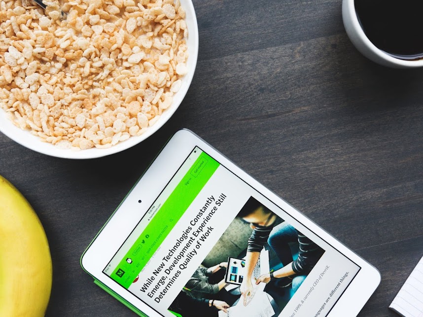
The footer design for this tutorial
Bootstrap Footer
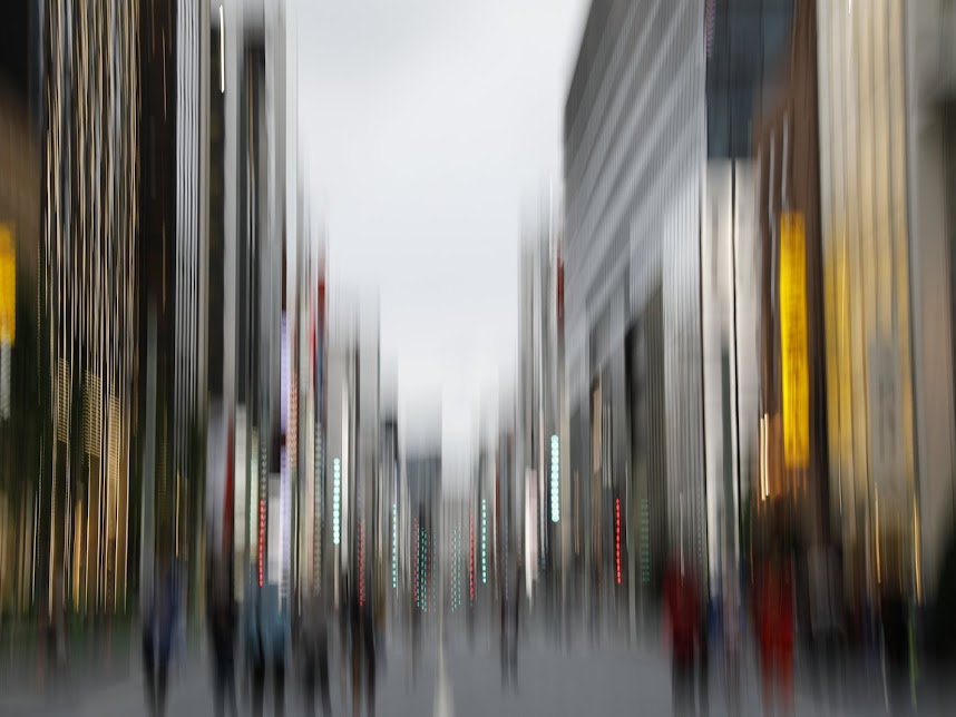
The syntax of the Bootstrap footer
<!-- Footer Main Area-->
<footer class="bg-white">

   <!-- Grid row -->
   <div class="row">

      <!-- Full-width single-column -->
      <div class="col-12">

         <!-- Full-width Expandable Area With Background -->
         <div class='text-center bg-dark-overlay-5 overflow-hidden card-bg-scale' style='background-image: url("PASTE IMAGE URL"); background-repeat: no-repeat; background-size:100% 100vh; background-position: right center;background-attachment:fixed; height:auto;'>
             <p class='text-white p-3'>Expandable area for TITLE, FORM OR ADS</p>
         </div>

         <!-- End of Full-width Expandable Area With Background -->

         <div class='col-12'>
            <div class='row'>
               <!-- Footer Menu -->
               <div class='col-md-4 text-center pt-4'>
                  <h5 class='text-uppercase mt-2'>Title 1</h5>
                  <ul class='list-unstyled pb-2'>
                     <li>Add form/Link 1</li>
                     <li>Add form/Link 2></li>
                  </ul>
               </div>
               <!-- End of Footer Menu -->

               <!-- Logo, Social Buttons and Footend -->
               <div class='col-md-12 text-center pt-2'>
                 <div class='mx-auto mt-2' style='height:60px; width:60px'>
                    <a href='' alt='LOGO IMAGE'><img href=''/></a>
                 </div>
                 <p class='h6'>Add blog name here</p>
                 <ul class='list-unstyled d-block text-center'>
                    <li class='d-inline'>
                       <a class='fb-ic me-3' role='button'>
                          <i class='fab fa-lg fa-facebook-f text-primary me-2'></i>
                       </a>
                    </li>
                    <li class='d-inline'>
                       <a class='fb-ic me-3' role='button'>
                          <i class='fab fa-twitter fa-lg text-info'></i>
                       </a>
                    </li>
                    <li class='d-inline'>
                       <a class='gplus-ic mr-3' role='button'>
                          <i class='fab fa-lg fa-google-plus-g text-danger ml-2'></i>
                       </a>
                    </li>
                 </ul>
                 <div class='text-center py-2 bg-dark'>
                    <small class='text-center text-white'>Copyright <span>BLOG</span><span>©</span><span class='mr-2'></span><span><script>document.write(new Date().getFullYear());</script></span>  -  <span>All Rights Reserved.</span>
                    </small>
                  </div>
               </div>
               <!-- End of Logo, Social Buttons and Footend -->
            </div>
         </div>

      </div>
      <!-- End of Full-width single-column -->

   </div>
   <!-- End of Grid row -->

</footer>
<!-- End of Footer Main Area-->
Understand footer markup elements.
- Background color - Replace "bg-dark" in the
<footer>tag to your theme background color scheme such as "bg-light" or "bg-primary". This will change the entire color scheme for your footer. - Background image - You can add an image as a background to
<footer>tag or any footer item content by adding"background-image: url("Image URL");".-
Special Criteria : You can create a scrollable background image by utilizing
"background-attachment:fixed". - Common issue : The above criteria can lead to jumpy background image issue on mobile view for blogger.
-
Solution : You need to ensure that the height of the background image occupies the entire height of the
<div>tag by using"background-size:105% 100vh; background-position: right center;"elements. You should also use the image with the right size for your<div>tag to avoid distorted displayed image issue.
-
Special Criteria : You can create a scrollable background image by utilizing
- Bootstrap mask for an overlay purpose - To create an elegant look to your background image.
-
How to add : Insert the entire footer item content within
<div class="mask flex-center rgba-black-strong">tag. This will scale your overlay exactly same as the height of background image. - Color scheme selection : You can refer to 300 delightful colors from mdbootstrap.com to design your theme.
-
How to add : Insert the entire footer item content within
Conclusion
A footer is one of the main blogger components to display various information such as a subscription form, a contact form, social buttons or navigation menu. You can create an elegant footer to match your theme design with your own CSS style. However, creating your own CSS style is a time consuming process, and this is the time when Bootstrap CSS framework comes in handy to make the process easier. It is free and easy to install in your blogger. We hope that this post provides information that will expedite your process to add a working Bootstrap footer.
More bootstrapping for your blog
Bootstrap CSS Framework has a lot more to offer. Endless design combination you can create with a simple knowledge on how to use Bootstrap.
