Method to install Bootstrap mega menu in blogger

Bootstrap 5 Mega Menu
Bootstrap mega menu utilizes navigation components and CSS elements from Bootstrap CSS Framework to make it automatically responsive to fit perfectly on any screen sizes, and it is highly flexible in styling to meet or match any template themes.
Introduction
Bootstrap 5 Responsive Mega Menu is really coming in handy to display a huge volume of information on any blog navigation menu. This mega menu is enhanced with bootstrap 5 navbar features that allow bloggers to manage information such as label links, images, videos or a sitemap in its extended dropdowns.
Important features of the mega menu is it's responsive charateristic to any of users' display screen size and the content of the Mega Menu dropdowns can be divided into smaller categories or column sections to enhance the UX of blogs.
The mega menu information display and navigation function can be further improved by using Bootstrap 5 components and CSS elements such as image carousel, grid, accordion or buttons.
Bootstrap 5 Mega Menu HTML Markup
The HTML markup for the mega menu is shown as below. This menu is built with Bootstrap 5 and MDBootstrap CSS frameworks only. There is no additional CSS or Javascript files required.
<nav class="navbar navbar-expand-lg navbar-light bg-light">
<div class="container">
<a class="navbar-brand" href="#">
<img class="navbar-brand-item" src="LOGO URL" alt="logo">
BLOG
</a>
<div class="collapse navbar-collapse" id="megaMenu">
<ul class="navbar-nav navbar-nav-scroll ms-auto">
<!-- LINK ITEM -->
<li class="nav-item"><a class="nav-link" href="ADD URL HERE">ITEM</a></li>
<!-- Nav item 1 SINGLE COLUMN -->
<li class="nav-item dropdown bg-white">
<a class="nav-link dropdown-toggle" href="#" id="Link1" role="button" data-mdb-toggle="dropdown" aria-haspopup="true" aria-expanded="false">ITEM</a>
<ul class="dropdown-menu" aria-labelledby="Link1">
<li> <a class="dropdown-item" href="URL ONE">Dropdown Item 1</a></li>
<li> <a class="dropdown-item" href="URL TWO">Dropdown Item 2</a></li>
<li> <a class="dropdown-item" href="URL THREE">Dropdown Item 3</a></li>
<li> <a class="dropdown-item" href="URL FOUR">Dropdown Item 4</a></li>
</ul>
</li>
<!-- Nav item 2 DROPEND ROW -->
<li class="nav-item dropdown bg-white">
<a class="nav-link dropdown-toggle" href="#" id="Link2" role="button" data-mdb-toggle="dropdown" aria-haspopup="true" aria-expanded="false">ITEM</a>
<ul class="dropdown-menu" aria-labelledby="Link2">
<li> <a class="dropdown-item" href="URL ONE">Dropdown Item 1</a></li>
<li> <a class="dropdown-item" href="URL TWO">Dropdown Item 2</a></li>
<li class="dropdown-divider"></li>
<li class="dropdown-submenu dropend">
<a class="dropdown-item dropdown-toggle" href="#">Dropdown (end) Item 3</a>
<ul class="dropdown-menu" data-bs-popper="none">
<li> <a class="dropdown-item" href="#">Dropdown (end) sub-item 1</a> </li>
<li> <a class="dropdown-item" href="#">Dropdown (end) sub-item 2</a> </li>
</ul>
</li>
<li class="dropdown-submenu dropstart">
<a class="dropdown-item dropdown-toggle" href="#">Dropdown (start) Item 4</a>
<ul class="dropdown-menu dropdown-menu-end" data-bs-popper="none">
<li> <a class="dropdown-item" href="#">Dropdown (start) sub-item 1</a></li>
<li> <a class="dropdown-item" href="#">Dropdown (start) sub-item 2</a></li>
</ul>
</li>
<li class="dropdown-divider"></li>
</ul>
</li>
<!-- Nav item 4 MEGA -->
<li class="nav-item dropdown dropdown-fullwidth bg-white">
<a class="nav-link dropdown-toggle" href="#" id="Link4" role="button" data-mdb-toggle="dropdown" aria-haspopup="true" aria-expanded="false">ITEM</a>
<div class="dropdown-menu" aria-labelledby="Link4">
<div class="container">
<div class="row g-4 p-3 flex-fill">
<div class="col-sm-6 col-lg-4">
<div class="card bg-transparent">
<!-- Card img -->
<img class="card-img rounded" src="https://blogger.googleusercontent.com/img/b/R29vZ2xl/AVvXsEijagi7Cm_IRSfeM61RwK7-xU6nCbLmEo3jfcZMha0WM6lbLTC6FUV7-7XKGY3uB5IXM-hK17A4R6laIbTfpG0LOOpysBY0-7eK54MY4AbNUAHNjz5cAEqbQ2pu4N4rIlADWnFIyOLBEvM/w700-h394-p/man-1351317_640.png" alt="Card image">
<div class="card-body px-0 pt-3">
<h6 class="card-title mb-0">
<a href="#" class="btn-link text-reset fw-bold">
ADD TITLE
</a>
</h6>
<!-- Card info -->
<ul class="nav nav-divider align-items-center text-uppercase small mt-2">
<li class="nav-item">
<a href="#" class="text-reset btn-link">SITE LINK</a>
</li>
<li class="nav-item">PRICE</li>
</ul>
</div>
</div>
</div>
</div>
</div>
</div>
</li>
<!-- Nav item 5 Carousel Slide -->
<li class="nav-item dropdown dropdown-fullwidth bg-white">
<a class="nav-link dropdown-toggle" href="#" id="Link5" role="button" data-mdb-toggle="dropdown" aria-haspopup="true" aria-expanded="false">ITEM</a>
<div class="dropdown-menu" aria-labelledby="Link5">
<div class="container">
<div class="row row-cols-1 row-cols-lg-3 g-2 g-lg-3 p-3">
<div class="col-md-5 col-lg-5">
<div id="carouselDarkVariant" class="carousel slide carousel-fade carousel-dark" data-mdb-ride="carousel">
<!-- Indicators -->
<div class="carousel-indicators">
<button
data-mdb-target="#carouselDarkVariant"
data-mdb-slide-to="0"
class="active"
aria-current="true"
aria-label="Slide 1"
>
</button>
<button
data-mdb-target="#carouselDarkVariant"
data-mdb-slide-to="1"
aria-label="Slide 1"
>
</button>
<button
data-mdb-target="#carouselDarkVariant"
data-mdb-slide-to="2"
aria-label="Slide 1"
>
</button>
</div>
<!-- Inner -->
<div class="carousel-inner">
<!-- Single item -->
<div class="carousel-item active">
<img src="https://blogger.googleusercontent.com/img/b/R29vZ2xl/AVvXsEijagi7Cm_IRSfeM61RwK7-xU6nCbLmEo3jfcZMha0WM6lbLTC6FUV7-7XKGY3uB5IXM-hK17A4R6laIbTfpG0LOOpysBY0-7eK54MY4AbNUAHNjz5cAEqbQ2pu4N4rIlADWnFIyOLBEvM/w700-h394-p/man-1351317_640.png"
alt="Gallery image 1"
class="d-block w-100"
/>
<div class="carousel-caption d-none d-md-block">
<h5>First slide label</h5>
<p>Nulla vitae elit libero, a pharetra augue mollis interdum.</p>
</div>
</div>
<!-- Single item -->
<div class="carousel-item">
<img src="https://blogger.googleusercontent.com/img/b/R29vZ2xl/AVvXsEijagi7Cm_IRSfeM61RwK7-xU6nCbLmEo3jfcZMha0WM6lbLTC6FUV7-7XKGY3uB5IXM-hK17A4R6laIbTfpG0LOOpysBY0-7eK54MY4AbNUAHNjz5cAEqbQ2pu4N4rIlADWnFIyOLBEvM/w700-h394-p/man-1351317_640.png"
alt="Gallery image 1"
class="d-block w-100"
/>
<div class="carousel-caption d-none d-md-block">
<h5>Second slide label</h5>
<p>Lorem ipsum dolor sit amet, consectetur adipiscing elit.</p>
</div>
</div>
<!-- Single item -->
<div class="carousel-item">
<img src="https://blogger.googleusercontent.com/img/b/R29vZ2xl/AVvXsEijagi7Cm_IRSfeM61RwK7-xU6nCbLmEo3jfcZMha0WM6lbLTC6FUV7-7XKGY3uB5IXM-hK17A4R6laIbTfpG0LOOpysBY0-7eK54MY4AbNUAHNjz5cAEqbQ2pu4N4rIlADWnFIyOLBEvM/w700-h394-p/man-1351317_640.png"
alt="Gallery image 1"
class="d-block w-100"
/>
<div class="carousel-caption d-none d-md-block">
<h5>Third slide label</h5>
<p>Praesent commodo cursus magna, vel scelerisque nisl consectetur.</p>
</div>
</div>
</div>
<!-- Inner -->
<!-- Controls -->
<button
class="carousel-control-prev"
type="button"
data-mdb-target="#carouselDarkVariant"
data-mdb-slide="prev"
>
<span class="carousel-control-prev-icon" aria-hidden="true"></span>
<span class="visually-hidden">Previous</span>
</button>
<button
class="carousel-control-next"
type="button"
data-mdb-target="#carouselDarkVariant"
data-mdb-slide="next"
>
<span class="carousel-control-next-icon" aria-hidden="true"></span>
<span class="visually-hidden">Next</span>
</button>
</div>
</div>
<div class="col-md-2 col-lg-2">
<p class="fs-4 fw-bold">LINK</p>
<p class="fs-5">Link</p>
<p class="fs-5">Link</p>
<p class="fs-5">Link</p>
<p class="fs-5">Link</p>
</div>
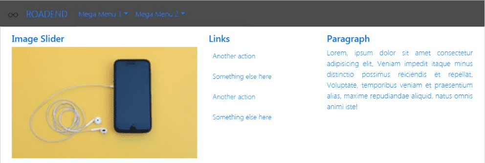
<div class="col-md-5 col-lg-5">
<p class="fs-4 fw-bold">TITLE</p>
<p class="fs-5">Bootstrap 5 Responsive Mega Menu is really coming in handy to display a huge volume of information on any blog navigation menu. This mega menu is enhanced with bootstrap 5 navbar features that allow bloggers to manage information such as label links, images, videos or a sitemap in its extended dropdowns.</p>
</div>
</div>
</div>
</div>
</li>
</ul>
</div>
<div class="nav ms-sm-3 flex-nowrap">
<div class="nav-item">
<button
class="navbar-toggler nav-item"
type="button"
data-mdb-toggle="collapse"
data-mdb-target="#megaMenu"
aria-controls="megaMenu"
aria-expanded="false"
aria-label="Toggle navigation"
>
<div class="d-flex flex-column">
<i class="fas fa-hamburger"></i>
<span class="text-body h6 d-sm-inline-block" style="font-size: 0.4950rem">LOVE</span>
</div>
</button>
</div>
<div class="nav-item ms-lg-5 me-lg-4">
<a class="nav-link pe-0" role="button" href="#" aria-expanded="false">
<i class="bi bi-search fs-5"></i>
</a>
</div>
</div>
</div>
</nav>General | Bootstrap 5 Mega Menu HTML Markup
This mega menu in it's raw format can be divided into 3 main parts.
- Left Section for Navbar-brand
- Middle Section for Navbar-collapse
- Link Item
- Single Column
- Dropend/Dropstart Column
- Mega Column
- Carousel Slide
- Right Section for
- Toggle navigation button
- Search button
<nav class="navbar navbar-expand-lg navbar-light bg-light">
  <div class="container">
    <a class="navbar-brand" href="#"> Left Section </a>
    <div class="collapse navbar-collapse" id="megaMenu"> Middle Section </div>
    <div class="nav ms-sm-3 flex-nowrap"> Right Section </div>
  </div>
</nav>
We can easily make errors during the information adding process and it is hard to identify the errors because the mega menu markup is a long markup. This general information on the mega menu markup is a helpful guideline to simplify the process to add blog information.
Mega Menu Installing Process Overview
The process to install a Bootstrap 4 Mega Menu on any blog is a simple process as shown below. However, you may find the process to add blog information and to style the menu based on blog theme, is a time consuming process.
General Process To Install Bootstrap 4 Mega Menu
- How to add mega menu markup
- How to Add Information in HTML
- How to Style The Mega Menu
How to add mega menu in the template?
Mega menu HTML markup must be added correctly to ensure that the menu is displayed at the top of page to overlap the header image. The markup must be added in the <header> tag as the first visible component as shown below.
<html>
   <head></head>
   <body>
      <header>
         <!-- Add The Mega Menu HTML Markup Here -->
         <nav class='navbar navbar-expand-md mask rgba-black-strong m-0'>...</nav>
         <!-- Header Image here -->
      </header>
   </body>
</html>
You need to copy and paste the mega menu HTML markup on your blog template as shown above, and start to add your blog information.
How to add information in the HTML markup
Information, that you add to the mega menu, is meant to help users to navigate your blog. This mega menu should enable you to simplify the process to display the information in an arrangement that is easier to understand by users.
These are information which need to be added in the HTML markup.
Blog Logo And Name
<a class="navbar-brand text-uppercase"' href="#">
   <img alt="logo" class="d-inline-block mr-3" height="30" src="PLACE YOUR LOGO URL HERE" />
   PLACE YOUR BLOG NAME HERE
</a>
Add logo URL and blog name in the markup respectively.
Navbar-collapse content
There are 5 type of Navbar-collapse contents in the markup.
- Link Item
- Single Column
- Dropend/Dropstart Column
- Mega Column
- Carousel Slide
The above design arrangement may not meet your requirement. You can change this menu design by adding or delete any of these contents or any of it's dropdown content.
In general, there are 2 main information required to fill up the menu.
Nav-item for dropdown title
<li class="nav-item dropdown bg-white">
   <a class="nav-link dropdown-toggle" href="#" id="Link2" role="button" data-mdb-toggle="dropdown" aria-haspopup="true" aria-expanded="false">Nav-item Title</a>
</li>
Dropdown-menu content
The are 3 type of dropdown content markups, which are in term of Bootstrap 5 Grid Component, Carousel and dropdown-item class as shown in the example below
<ul class="dropdown-menu" aria-labelledby="Link2">
   <li>
      <a class="dropdown-item" href="URL">Dropdown-menu content</a>
   </li>
</ul>
Search
There is no search engine provided in this mega menu markup. You can add your search engine in the section as shown below.
<div class="nav ms-sm-3 flex-nowrap">
   <div class="nav-item ms-lg-5 me-lg-4">
      <a class="nav-link pe-0" role="button" href="#" aria-expanded="false">
         <i class="bi bi-search fs-5"></i>
      </a>
   </div>
</div>
More bootstrapping for your blog
Bootstrap CSS Framework has a lot more to offer. Endless design combination you can create with a simple knowledge on how to use Bootstrap.
